R Quality Control Charts - ggQC v0.0.31
Quality Control Charts with ggQC
ggQC can help you generate all kinds of quality control (QC) charts and graphs. Building on ggplot’s faceting capabilities, ggQC allows you to easily make one or many control charts. In addition to QC charting, the package provides methods for violation, Pareto and capability analysis.
Installation
install.package("ggQC") devtools::install_github("kenithgrey/ggQC")- v0.0.31 fix
- a bug associated with drawing the 1n2 sigma lines on the QC charts.
- a strange ggplot bug around the word color and colour.
Control Charts
ggQC supports many different types of control chart methods including
- Individuals Charts : mR, XmR
- Attribute Charts : c, np, p, u
- Studentized Charts: xBar.rBar, xBar.rMedian, xBar.sBar, xMedian.rBar, xMedian.rMedian
- Dispersion Charts: rBar, rMedian, sBar
The process for building control charts is simple - especially in R-studio.
Step 1: Make sure you have the packages you need installed:
install.packages(c("ggplot2","ggQC"))Step 2: load your long-form data into R from a csv or other suitable format. The picture below provides an example of long form data.
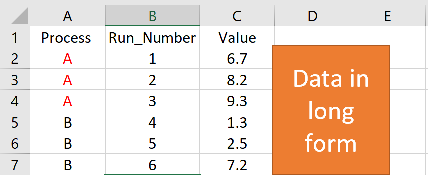
Step 3: make your control chart. In the example below, the first 2 lines of code load the libraries you need to run ggplot and ggQC. The next few lines generate some sample data. You’ll want to replace this section with a command to load your data from csv. The last few lines generate the control chart.
Control Chart Example
### Load the Needed Libraries
library(ggplot2)
library(ggQC)

### Make up some demo data (load your file here instead)
set.seed(5555)
Process_Data <-
  data.frame(
   Process=rep(c("A"), each = 30), #Process A
   Run_Number=c(1:30),             #Run Order
   Value = c(rnorm(n = 30, mean = 30.5, sd = 1)) #Process A Random Data
   )

### Make the plot
XmR_Plot <-
  ggplot(Process_Data, aes(x = Run_Number, y = Value)) + #init ggplot
  geom_point() + geom_line() + #add the points and lines
  stat_QC(method = "XmR", #specify QC charting method
          auto.label = T, # Use Autolabels
          label.digits = 2, #Use two digit in the label
          show.1n2.sigma = T  #Show 1 and two sigma lines
          ) +
  stat_QC(method="mR") +
  scale_x_continuous(expand =  expand_scale(mult = .15))  # Pad the x-axis


### Draw the plot - Done
XmR_Plot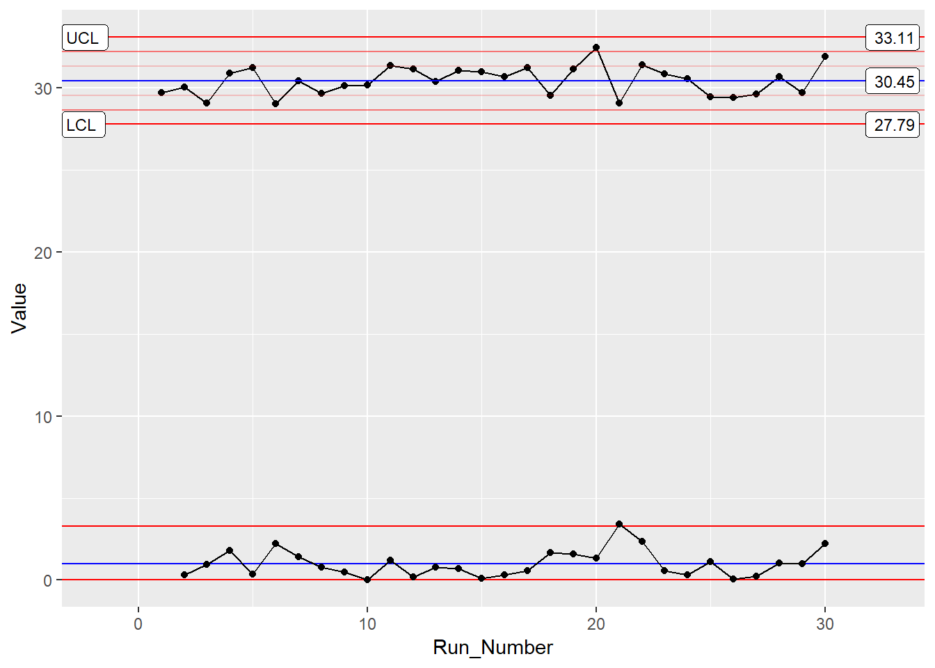
For more control chart examples checkout the docs, HOWTOs, and Vignettes provided on this site.
Violation Analysis
ggQC can check control chart data for violations using the stat_qc_violations() command. To do a violation analysis on the the data above run the following code:
QC_Violations <-
  ggplot(Process_Data, aes(x = Run_Number, y = Value)) + #init ggplot
  stat_qc_violations(method = "XmR"
                     #show.facets = 4 #if you just want facet 4
                     )
QC_Violations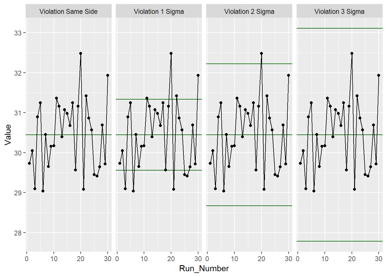
None of the standard 4 Shewart violations were observed. Awesome, next we’ll look at doing a capability analysis with ggQC.
Capability Analysis
In the last sections, you learned how to make a control chart with ggQC and check for violations, here you’ll learn how to do a basic capability analysis (cp, cpK etc.) on the same data. For this we will assume the customer has a lower specification limit of 25 and and upper specification limit of 37. With these parameters and the data already loaded from the previous example, you can do a graphical capability analysis in just a few simple lines of code:
CapabilityAnaylsis <-
 ggplot(Process_Data, aes(x = Value)) + #init ggplot
  geom_histogram(binwidth = .75, color="purple") + #make the histogram
  stat_QC_Capability(
    LSL=25, USL=37,                    #Specify LSL and USL
    show.cap.summary = c("Cp", "Cpk"), #selected summary
    digits = 2,                        #report two digits
    method="XmR") +                    #Use the XmR method
scale_x_continuous(expand =  expand_scale(mult = c(0.15,.65))) #pad the X-axis
CapabilityAnaylsis  #plot the graph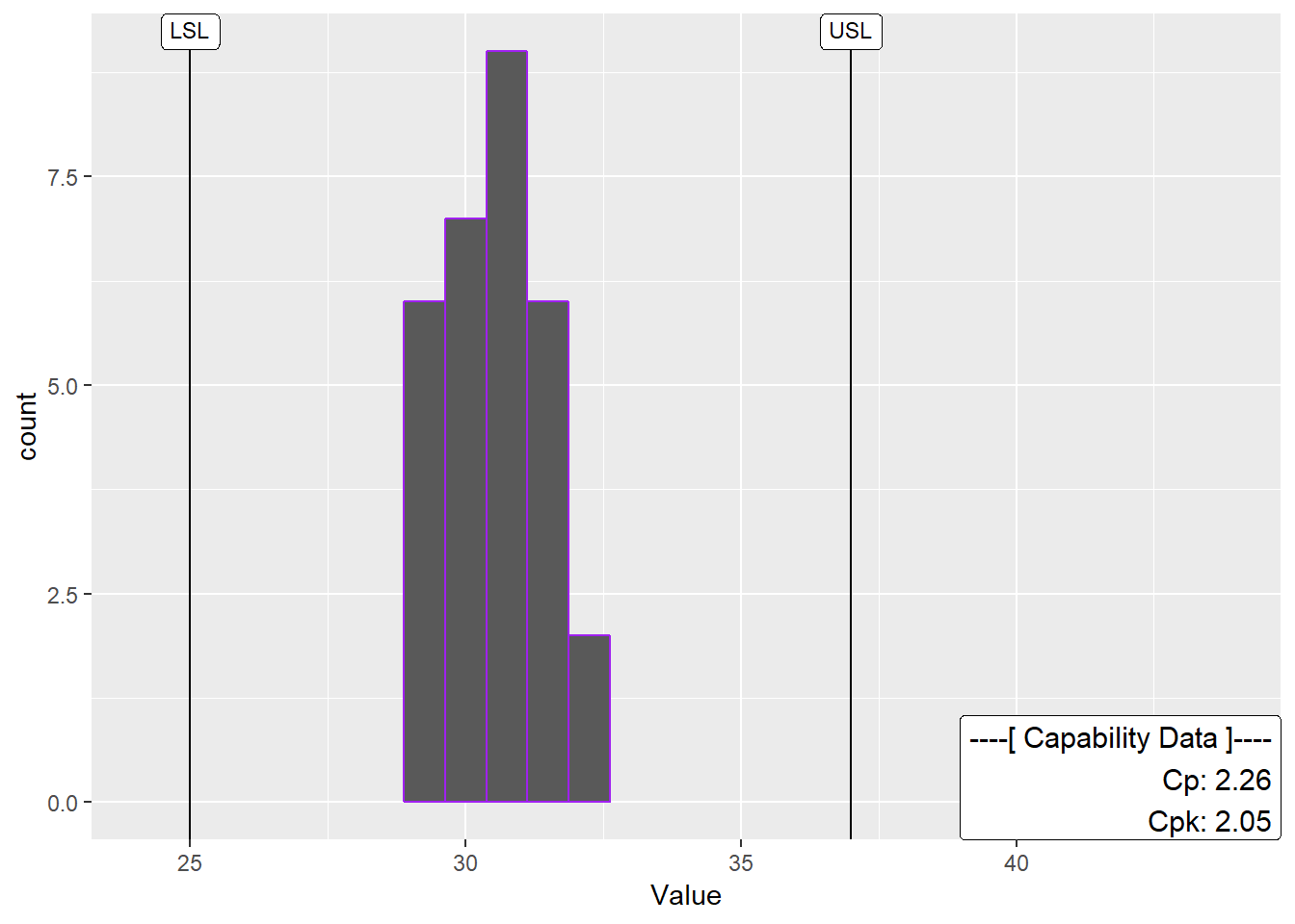
Cool! Looks like the process is in good shape. To see more examples of capability analysis checkout the ggQC documentation on stat_QC_Capability. I’m working on a Vignette. In the meantime, be aware that an xBar capability chart is specified slightly different than XmR.
Pareto Analysis
Alright, so your processes are in control. However, you know your process has bottlenecks. Where should you start? One way to help plan your attack is with a Pareto analysis. Suppose you have the following data showing how long several typical process steps take.
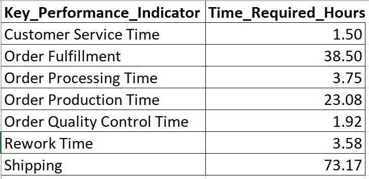
To generate a Pareto chart for this data in R using ggQC, simply load the data, tell ggplot about your data and let stat_pareto do the rest.
#load your data
Data4Pareto <- data.frame(
  KPI = c("Customer Service Time", "Order Fulfillment", "Order Processing Time",
        "Order Production Time", "Order Quality Control Time", "Rework Time",
        "Shipping"),
  Time = c(1.50, 38.50, 3.75, 23.08, 1.92, 3.58, 73.17)
)

#make the plot
ggplot(Data4Pareto, aes(x=KPI, y=Time)) +
 stat_pareto(point.color = "red",
             point.size = 3,
             line.color = "black",
             bars.fill = c("blue", "orange")
             ) +
  theme(axis.text.x = element_text(angle = 90, hjust = 1, vjust=0.5))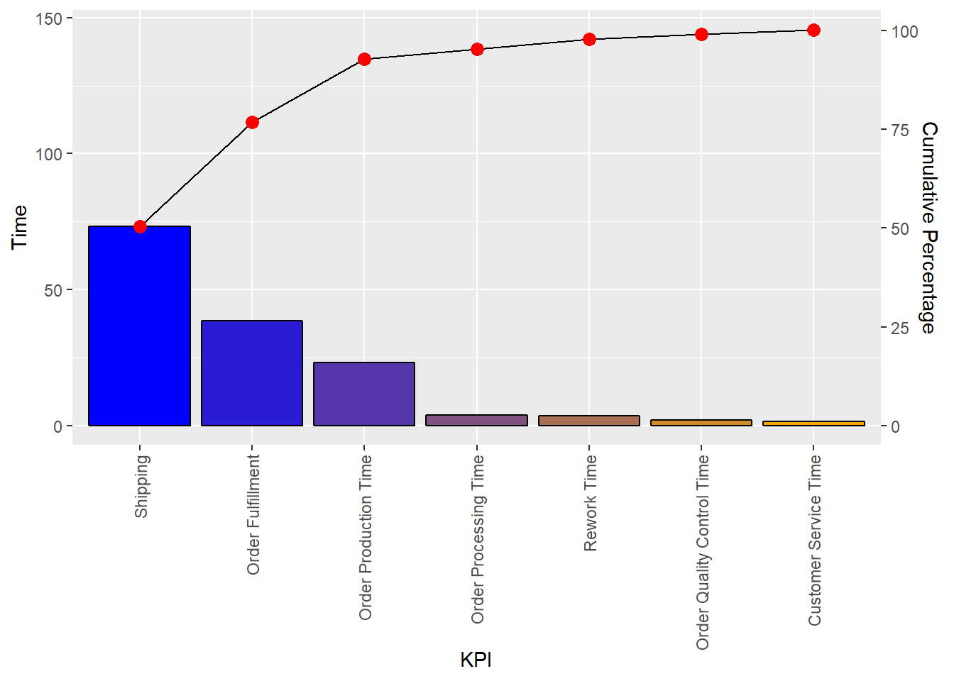
Known Issues
- If you have version 0.0.3 upgrade to 0.0.31 (github) this will fix
- a bug associated with drawing the 1n2 sigma lines on the QC charts.
- a strange ggplot bug around the word color and colour.
The plan it to release the fix to CRAN in early to mid December.
- Please report issues @ https://github.com/kenithgrey/ggQC/issues