stat_violations() Vignette
Introduction
In the XbarR Vignette, you learned how make Xbar and Rbar charts using some simulated candle stick data. Typically to identify when a process such as this is out of statistical control, we might look for points exceeding the 3 sigma limits. However there are a few additional rules we can apply (if we are careful order) that may give us an early warning that things are out of control before our product exceeds a 3 sigma limit or even worse a customer specification limit.
Using the ggQC stat_qc_violations() function you can detect when your process is potentially leaving the realm of statistical control using the following 4 rules.
Violation Same Side: 8 or more consecutive, same-side points
Violation 1 Sigma: 4 or more consecutive, same-side points exceeding 1 sigma
Violation 2 Sigma: 2 or more consecutive, same-side points exceeding 2 sigma
Violation 3 Sigma: any points exceeding 3 sigma
To demonstrate how the stat_qc_violations() function works, we are going to revisit the candle stick data. We are also going to add two additional columns for demonstration purposes:
- INDEX: Here the data has been sorted and numbered by mold cell then cycle.
- INDEX2: Here the data has been sorted and numbered by cycle then mold cell.
Why these 2 extra columns? The order of the observations is very important when considering other type of QC violations.
Setup the Data
set.seed(5555)
candle_df1t3 <- data.frame(
                Cycle = as.factor(rep(1:24, each=3)),
                candle_width = rnorm(n = 3*24, mean = 10, sd = 1),
                mold_cell = as.ordered(rep(1:3))
             )

candle_df4 <- data.frame(
                Cycle = as.factor(rep(1:24, each=1)),
                candle_width = rnorm(n = 1*24, mean = 11, sd = 2),
                mold_cell = as.ordered(rep(4, each=24))
             )

candle_df <- rbind(candle_df1t3, candle_df4)


candle_df <- candle_df[order(candle_df$Cycle, candle_df$mold_cell),]
  candle_df$INDEX <- 1:nrow(candle_df)

candle_df <- candle_df[order(candle_df$mold_cell, candle_df$Cycle),]
  candle_df$INDEX2 <- 1:nrow(candle_df)

library(dplyr)
library(ggplot2)
library(ggQC)
Basic XmR Plots
Ok, you’ve setup the data that you just got from the production line and this is what you get when you plot an XmR plot of the data sorted by cycle then mold cell:
XmR <- ggplot(candle_df, aes(x = INDEX, y = candle_width, group = 1)) +
         geom_point() + geom_line() +
         theme(axis.text.x = element_text(angle = 90, hjust = 1, vjust=0.5)) +
         stat_QC(method = "XmR")

XmR + ggtitle("Candle Data", subtitle = "Ordered by Cycle then Mold Cell")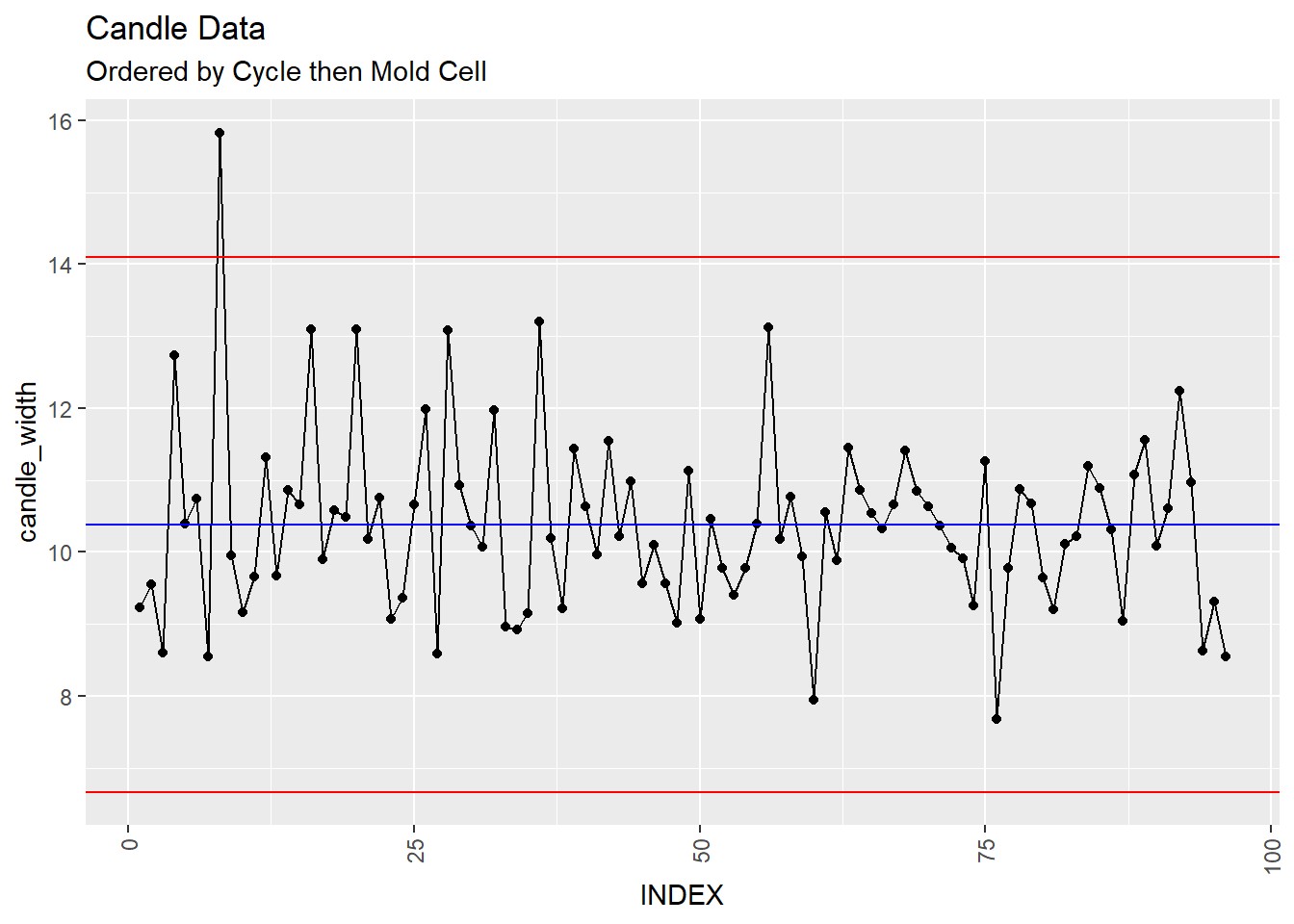
XmR %+% aes(x=INDEX2) +
  ggtitle("Candle Data", subtitle = "Ordered by Mold Cell then Cycle")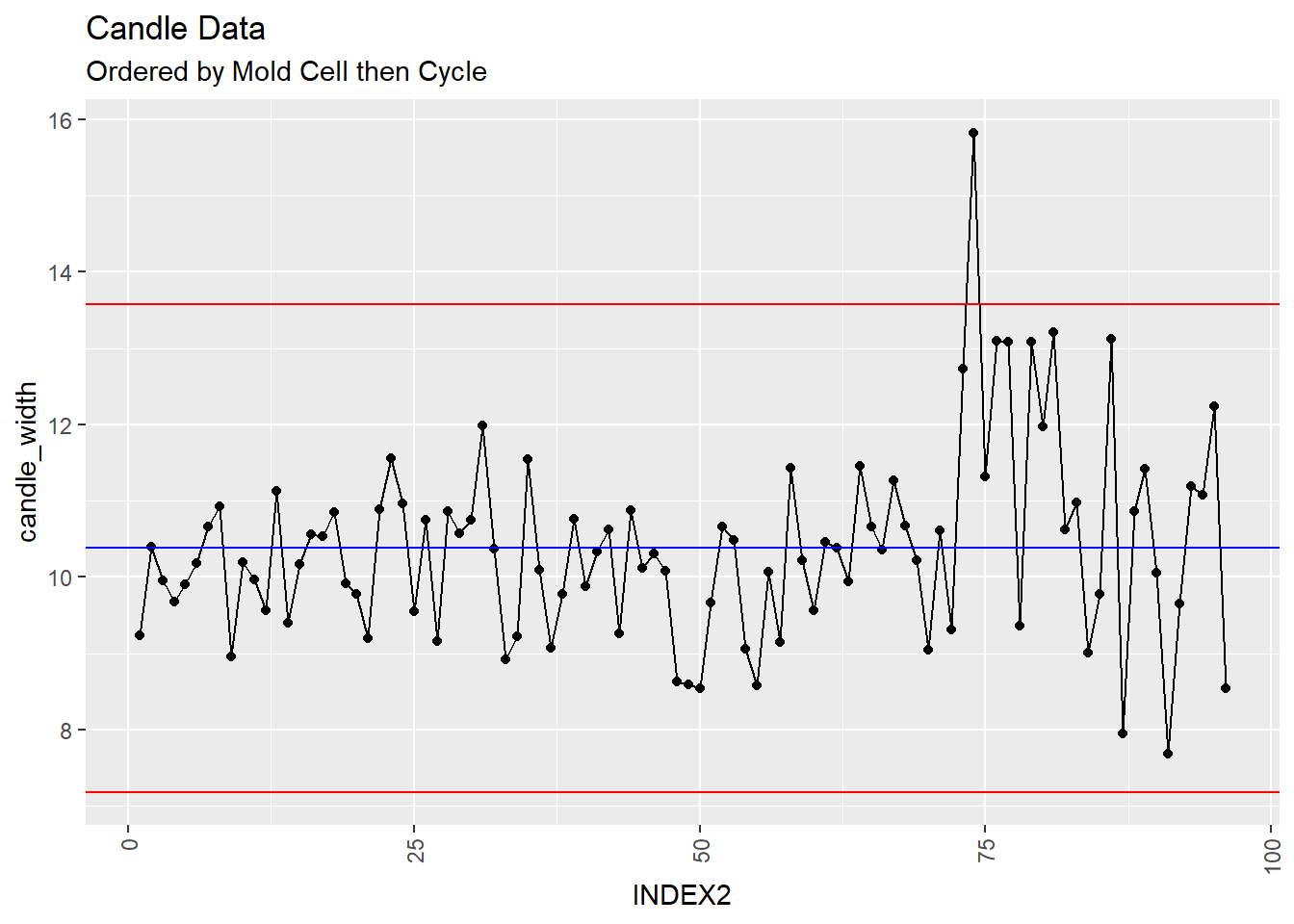
You look at first and second control charts and at a glance you might say, “The total number of samples is 96. Having, one out of nearly 100 fall out of the control limits might be expected.”
However, when you order by the mold cell then cycle, the last 75 data points or so look suspicious. lets see what the violation plots have to say.
Violation Plots
Note the reordering of the candle dataset by INDEX2 (Mold Cell then Cycle)
XmR.violations <-
         ggplot(candle_df[order(candle_df$INDEX2),], #Reordering data frame
                aes(x = INDEX2, y = candle_width, group = 1)) +
         stat_qc_violations(method = "XmR") +
         theme(axis.text.x = element_text(angle = 90, hjust = 1, vjust=0.5))

XmR.violations +
  ggtitle("Candle Violation Data", subtitle = "Ordered by Mold Cell then Cycle")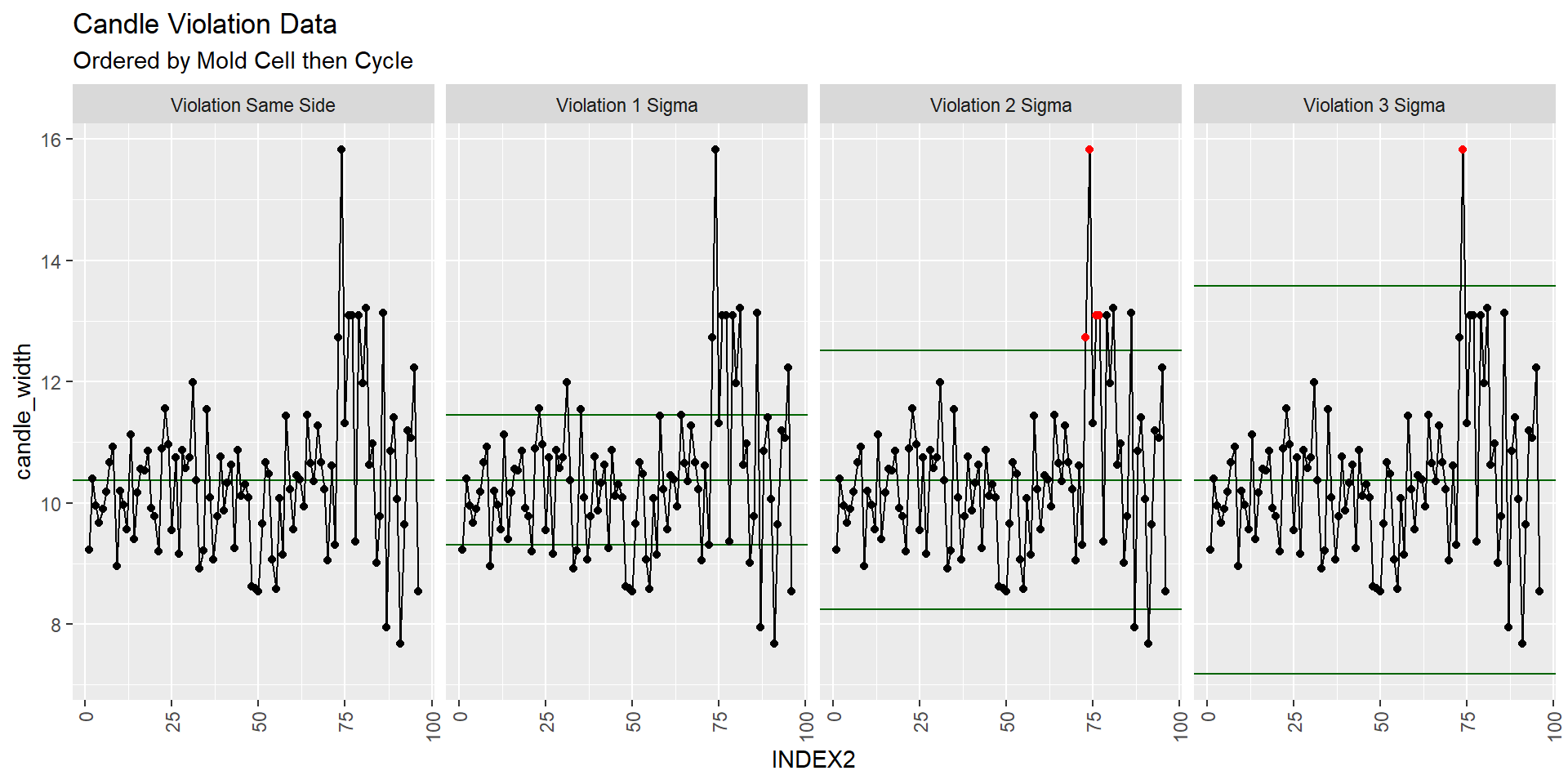
Indeed there seems to be something up with the data in the last quarter of the plot. What samples do these correspond to?
Violating Data
QC_Violations(data = candle_df$candle_width, method = "XmR" ) %>%
  filter(Violation == T) %>%
  select(Index) ->
Violalating_Rows

candle_df[Violalating_Rows$Index,]
## Cycle candle_width mold_cell INDEX INDEX2
## 73 1 12.73433 4 4 73
## 74 2 15.82843 4 8 74
## 76 4 13.09748 4 16 76
## 77 5 13.08984 4 20 77
## 74.1 2 15.82843 4 8 74hmm? All of these come from mold cell 4. You make an XmR plot by mold cell and see if anything is up.
Faceting
XmR <- ggplot(candle_df,
      aes(x = Cycle, y = candle_width, group = 1, color = mold_cell)) +
         geom_point() + geom_line() +
         stat_QC(method="XmR") + stat_QC_labels(method="XmR") +
         facet_grid(.~mold_cell)


XmR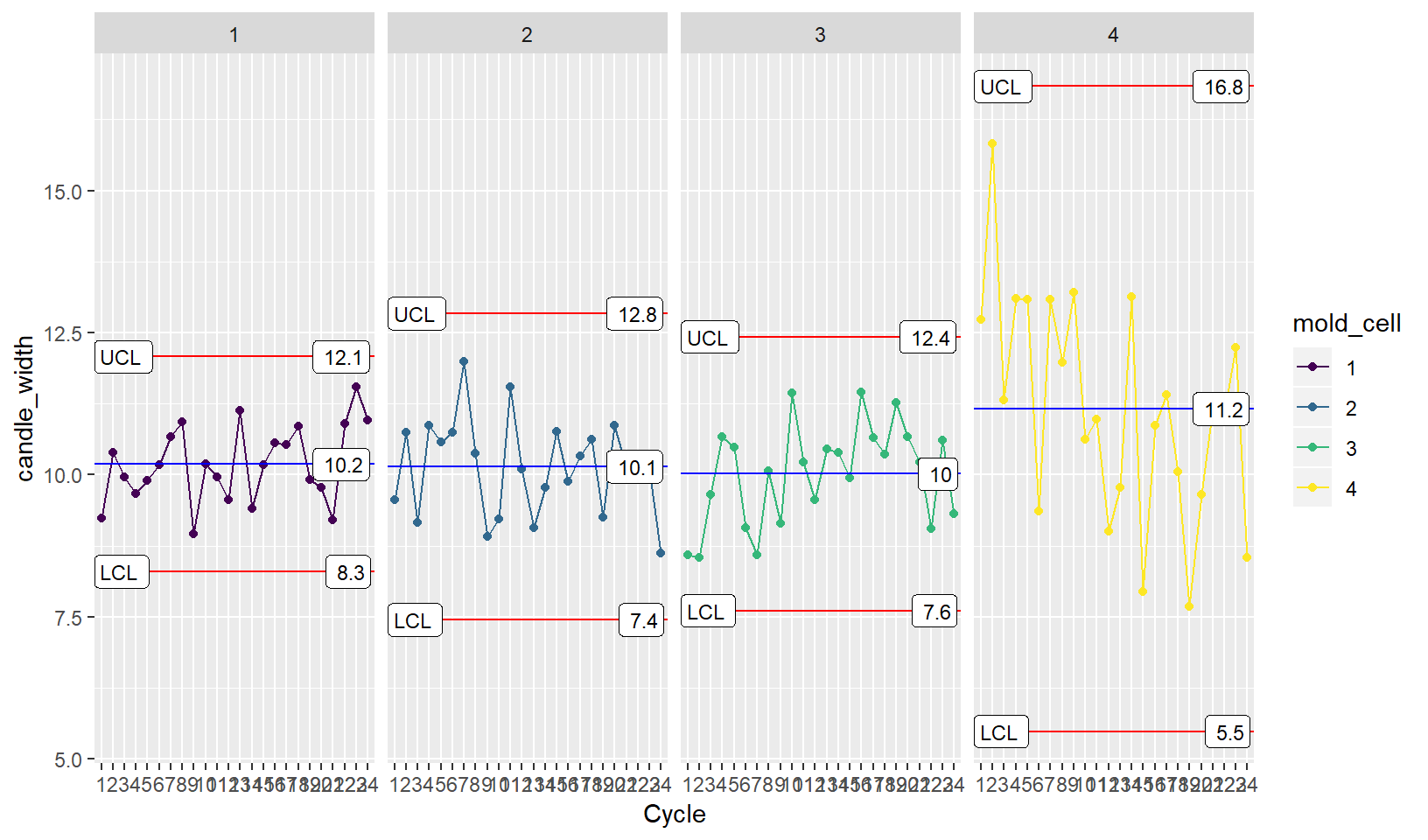
You notice that the variation and mean for mold cell 4 is high. You go down to the production floor to check it out.
For more Information and Examples using ggQC please visit (ggQC.r-bar.net)