ggQC HOWTO - Stat_QC()
Kenith Grey
2018-12-04
Description
Produce QC charts with ggplot framework. Support for faceting and layering of multiple QC chart lines on a single plot. Charts supported (see method argument for call):
- Individuals Charts: mR, XmR,
- Attribute Charts: c, np, p, u,
- Studentized Charts: xBar.rBar, xBar.rMedian, xBar.sBar, xMedian.rBar, xMedian.rMedian,
- Dispersion Charts: rBar, rMedian, sBar.
To label chart lines see stat_QC_labels
Usage
stat_QC(mapping = NULL, data = NULL, geom = "hline",
        position = "identity", na.rm = FALSE, show.legend = NA,
        inherit.aes = TRUE, n = NULL, method = "xBar.rBar",
        color.qc_limits = "red", color.qc_center = "green", ...)
Specialized Args: Stat_QC()
n: number, for
- Studentized Charts, used for custom or hypothetical subgroup size.
- np Charts, used to specify a fixed area of opportunity.
method : string, calling the following methods:
- Individuals Charts: mR, XmR,
- Attribute Charts: c, np, p, u,
- Studentized Charts: xBar.rBar, xBar.rMedian, xBar.sBar, xMedian.rBar, xMedian.rMedian
- Dispersion Charts: rBar, rMedian, sBar.
- color.qc_limits: color, used to colorize the plot’s upper and lower control limits.
- color.qc_center: color, used to colorize the plot’s center line.
- color.point: color, used to colorize points in studentized plots. You will need geom_point() for C, P, U, NP, and XmR charts.
- color.line: color, used to colorize lines connecting points in studentized plots. You will need geom_line() for C, P, U, NP, and XmR charts.
- physical.limits: vector, specify lower physical boundary and upper physical boundary
- auto.label: boolean setting, if T labels graph with control limits.
- limit.txt.label: vector, provides option for naming or not showing the limit text labels (e.g., UCL, LCL)
- limit.txt.label: c(“LCL”, “UCL”): default
- limit.txt.label: c(“Low”, “High”): changes the label text to low and high
- limit.txt.label: NA: does not show label text.
- label.digits: integer, number of decimal places to display.
- show.1n2.sigma: boolean setting, if T labels graph 1 and 2 sigma lines. Line color is set by color.qc_limits
…: other arguments passed on to layer. These are often aesthetics, used to set an aesthetic to a fixed value, like color = “red” or size = 3. They may also be parameters to the paired geom/stat.
Examples
# Setup Data --------------------------------------------------------------
set.seed(5555)
Process1 <- data.frame(processID = as.factor(rep(1,100)),
                       metric_value = rnorm(100,0,1),
                       subgroup_sample=rep(1:20, each=5),
                       Process_run_id = 1:100)
Base Plots
#INDV
INDV <- ggplot(Process1, aes(x=Process_run_id, y = metric_value)) +
       geom_point() + geom_line() +
       ggtitle("XmR", "geom_point() and geom_line() required") +
       ylim(-3,3) + #make scales same
       scale_x_continuous(expand =  expand_scale(mult = .15)) #pad x-axis

#xBar
xBar <- ggplot(Process1, aes(x=subgroup_sample, y = metric_value)) +
        ggtitle("xBar.rBar", subtitle = "Yes, it's blank, go to next section") +
        ylim(-3,3) + #make scales same
        scale_x_continuous(expand =  expand_scale(mult = .15)) #pad x-axis

#put both plots side by side for comparison
gridExtra::grid.arrange(INDV, xBar, nrow=1)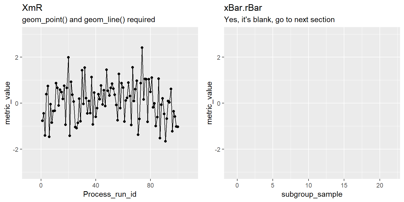
XmR & xBar.rBar with Default QC Overlay
#XmR
INDV2 <- INDV + stat_QC(method="XmR") +
         ggtitle("XmR", subtitle = "Default QC lines")

#xBar.rBar
xBar2 <- xBar +  stat_QC(method="xBar.rBar") +
         ggtitle("xBar.rBar", subtitle = "Default QC lines")

#put both plots side by side for comparison
gridExtra::grid.arrange(INDV2, xBar2, nrow=1)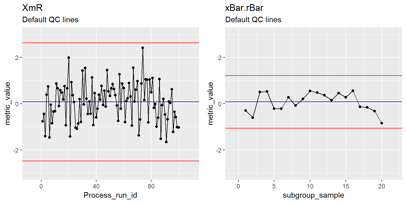
XmR & xBar.rBar with QC Lines and Labels
#XmR
INDV2 <- INDV + stat_QC(method="XmR", auto.label = T) +
         ggtitle("XmR", subtitle = "Auto Label QC lines")

#xBar.rBar
xBar2 <- xBar +  stat_QC(method="xBar.rBar", auto.label = T) +
         ggtitle("xBar.rBar", subtitle = "Auto Label QC lines")

#put both plots side by side for comparison
gridExtra::grid.arrange(INDV2, xBar2, nrow=1)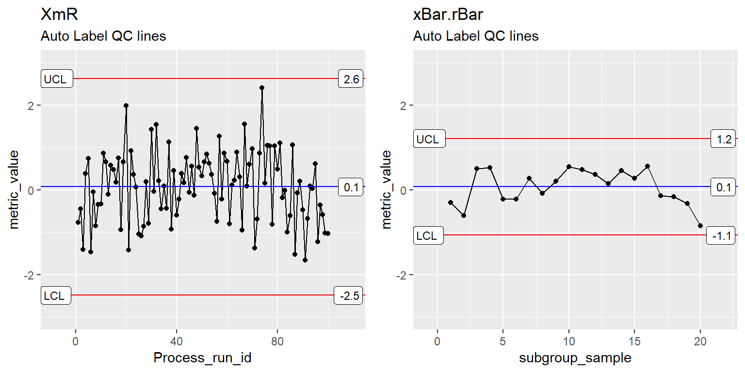
XmR & xBar.rBar with QC Lines and Labels & Sigma lines
#XmR
INDV2 <- INDV + stat_QC(method="XmR", auto.label = T , show.1n2.sigma = T) +
         ggtitle("XmR", subtitle = "show.1n2.sigma = T")

#xBar.rBar
xBar2 <- xBar +  stat_QC(method="xBar.rBar", auto.label = T, show.1n2.sigma = T) +
         ggtitle("xBar.rBar", subtitle = "show.1n2.sigma = T")

#put both plots side by side for comparison
gridExtra::grid.arrange(INDV2, xBar2, nrow=1)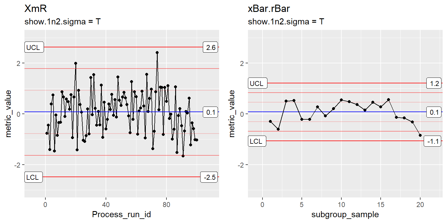
XmR & xBar.rBar with more digits
#XmR
INDV2 <- INDV + stat_QC(method="XmR", auto.label = T , show.1n2.sigma = T,
                        label.digits = 3) +
         ggtitle("XmR", subtitle = "label.digits = 3")

#xBar.rBar
xBar2 <- xBar +  stat_QC(method="xBar.rBar", auto.label = T, show.1n2.sigma = T,
                         label.digits = 3) +
         ggtitle("xBar.rBar", subtitle = "abel.digits = 3")

#put both plots side by side for comparison
gridExtra::grid.arrange(INDV2, xBar2, nrow=1)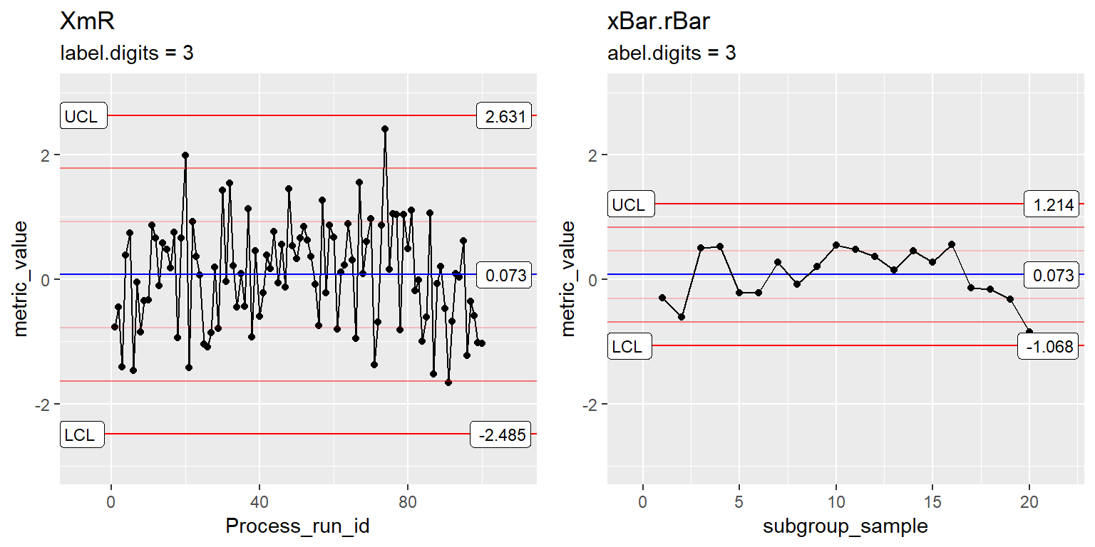
Change Center-Line Color
#XmR
INDV2 <- INDV + stat_QC(method="XmR", auto.label = T , show.1n2.sigma = T,
                        color.qc_center = "purple") +
         ggtitle("XmR", subtitle = "color.qc_center = 'purple'")

#xBar.rBar
xBar2 <- xBar +  stat_QC(method="xBar.rBar", auto.label = T, show.1n2.sigma = T,
                         color.qc_center = "purple") +
         ggtitle("xBar.rBar", subtitle = "color.qc_center = 'purple'")

#put both plots side by side for comparison
gridExtra::grid.arrange(INDV2, xBar2, nrow=1)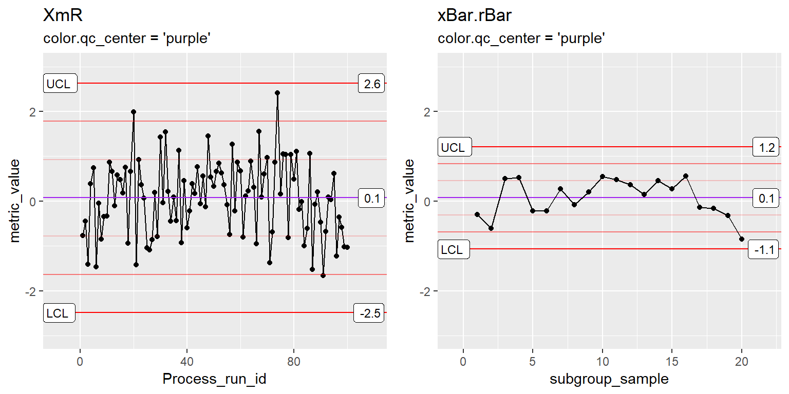
Change Limit-Line Color
#XmR
INDV2 <- INDV + stat_QC(method="XmR", auto.label = T , show.1n2.sigma = T,
                        color.qc_center = "purple", color.qc_limits = "darkgreen") +
         ggtitle("XmR", subtitle = "color.qc_limits = 'darkgreen'")

#xBar.rBar
xBar2 <- xBar +  stat_QC(method="xBar.rBar", auto.label = T, show.1n2.sigma = T,
                         color.qc_center = "purple", color.qc_limits = "darkgreen") +
         ggtitle("xBar.rBar", subtitle = "color.qc_limits = 'darkgreen'")

#put both plots side by side for comparison
gridExtra::grid.arrange(INDV2, xBar2, nrow=1)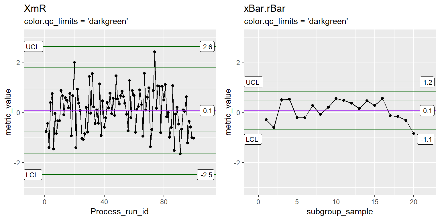
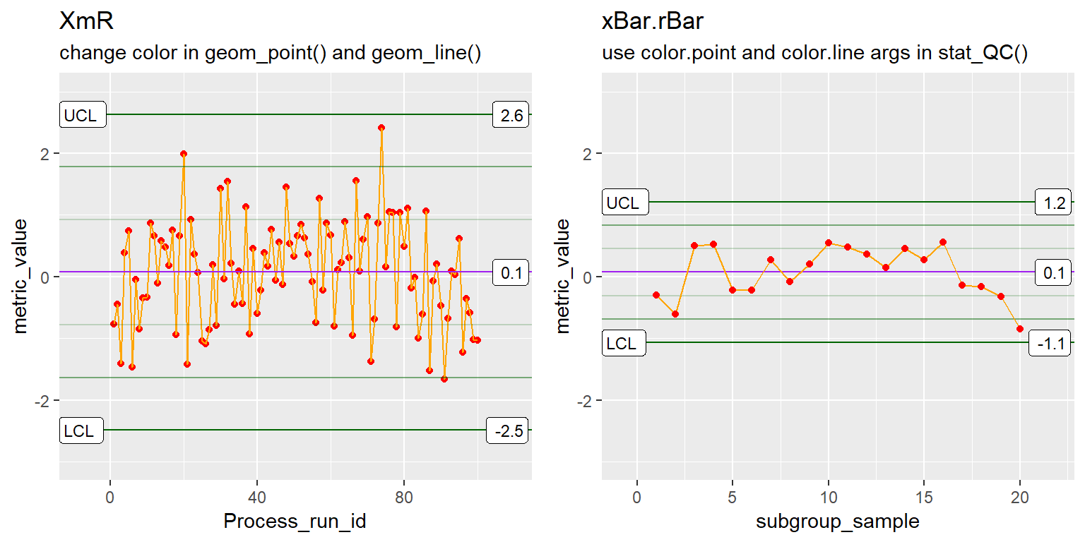
Change point and line Color
#XmR
INDV3 <- ggplot(Process1, aes(x=Process_run_id, y = metric_value)) +
       geom_point(color="red") + geom_line(color="orange") +
       stat_QC(method="XmR", auto.label = T , show.1n2.sigma = T,
               color.qc_center = "purple", color.qc_limits = "darkgreen") +
       ggtitle("XmR", "change color in geom_point() and geom_line()") +
       ylim(-3,3) +
       scale_x_continuous(expand =  expand_scale(mult = .15))

#xBar.rBar
xBar3 <- xBar +  stat_QC(method="xBar.rBar", auto.label = T, show.1n2.sigma = T,
                         color.qc_center = "purple", color.qc_limits = "darkgreen",
                         color.point = "red", color.line = "orange") +
         ggtitle("xBar.rBar", subtitle = "use color.point and color.line args in stat_QC()")

#put both plots side by side for comparison
gridExtra::grid.arrange(INDV3, xBar3, nrow=1)