ggQC HOWTO - stat_pareto()
2018-12-04
Description
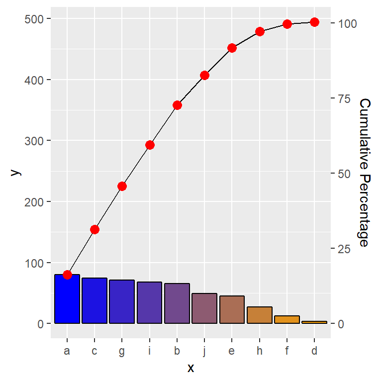
ggplot stat function to produce a pareto chart.
Usage
stat_pareto(mapping = NULL, data = NULL, geom = "point", position = "identity", show.legend = NA, inherit.aes = TRUE, group = 1, na.rm = FALSE, point.color = "black", point.size = 2, line.color = "black", line.size = 0.5, bars.fill = c("red", "white"), ...)Specialized Args:
group defines grouping for variable for pareto plot, default and suggested is 1.
point.color color, used to define point color of cumulative percentage line
point.size number, used to define point size of cumulative percentage line
line.color color, used to define line color of cumulative percentage line
line.size color, used to define line weight of cumulative percentage line
bars.fill character vector length 2, start and end colors for pareto bars.
Examples
# Setup Data --------------------------------------------------------------
 df <- data.frame(
                  x = letters[1:10],
                  y = as.integer(runif(n = 10, min = 0, max=100))
                 )
# Render Pareto Plot ------------------------------------------------------
ggplot(df, aes(x=x, y=y)) +
stat_pareto(point.color = "red",
point.size = 3,
line.color = "black",
#size.line = 1,
bars.fill = c("blue", "orange")
)