stat_pareto(Bottleneck)
2018-12-04
Pareto charts are part of the root cause anaylsis toolkit in many quality control systems, and they can be very useful in focusing development or engineering efforts on the issues that are going to have the greatest inpact on say product quality or organizational performance.
In this vignette, we are going to use the stat_pareto() function of the ggQC package to make a pareto chart. To assist our exploration, we are going to pretend that we have just been hiered by ACME Washer Company.
Congrats!
You just landed at mangment job at ACME Washer Co. Ok, its not the job of your dreams but you start on Monday.
Monday Morning:
First day on the job and the boss pulls you into the office and explains that things are not going well at ACME Washer Co. You lift an eyebrow, thinking, “you could have mentioned this before I agreed to work here”.
The boss smiles and continues, “So here is the rub, our production is out of control, orders are late and customers are angry.” The boss sighs, “Your first task is to help us understand what we are doing wrong. Oh, by the way, we need this quick. Our major customer is getting ready to go with our competetor, SIGMA Washer Co.”
Monday Afternoon: Plan
After spending the morning on the production floor, you get the team together, introduce your self, and ask them to explain what it is they do and how orders and raw material are converted into product and cash flow. Together the team draws you a flow diagram that looks like this:
[Flow Diagram Here]
Still a little unsure about how the plant works. You plan a three day study to look at how long it takes raw materials to become 3 batches of finished product. As part of the plan, you classify the workflowinto a few key groups. * Order Process Time * Order Prodtion Time * Order Quality Control Time * Order Fulfilmment Time * Customer Service
Tuesday-Thursday: Do
The last few days have been busy and without formally looking at the data you’ve notice a few things that have left you wondering - why or rather how ACME Washer Co. is still opperating. Nontheless you’re determined to make a positive impact. Tomorrow morning all the data will be ready to process.
Friday: Check
Ok the data is in, the first batch of data is shown below, the rest of the data set can be downloaded from here
| Key_Performance_Indicator | Process | Order | Start_Time | End_Time |
|---|---|---|---|---|
| Order Processing Time | Receive Customer Requests for Washers | 1 | 2017-12-01 08:00 AM | 2017-12-01 08:10 AM |
| Order Processing Time | Check on Hand Materials | 1 | 2017-12-01 08:10 AM | 2017-12-01 08:30 AM |
| Order Processing Time | Confirm Washer Order | 1 | 2017-12-01 08:30 AM | 2017-12-01 08:35 AM |
| Order Processing Time | Communicate Process to Production Line | 1 | 2017-12-01 08:35 AM | 2017-12-01 09:00 AM |
| Order Production Time | Worker Checks Out Rod Stock | 1 | 2017-12-01 09:00 AM | 2017-12-01 09:05 AM |
| Order Production Time | Worker Cuts Rod Stock to 100 Circles | 1 | 2017-12-01 09:05 AM | 2017-12-01 12:00 PM |
| Order Production Time | Worker Drills Holes in 100 Circles | 1 | 2017-12-01 12:00 PM | 2017-12-01 03:00 PM |
| Order Quality Control Time | QC Checks Washers | 1 | 2017-12-01 03:00 PM | 2017-12-01 03:30 PM |
| Order Quality Control Time | QC Rejects Washers | 1 | 2017-12-01 03:30 PM | 2017-12-01 03:45 PM |
| Rework Time | Worker Reworks Washers | 1 | 2017-12-01 03:45 PM | 2017-12-01 05:45 PM |
| Order Quality Control Time | QC Checks Washers | 1 | 2017-12-01 05:45 PM | 2017-12-01 05:55 PM |
| Order Fulfillment | Move Washers to Shipping Area | 1 | 2017-12-01 05:55 PM | 2017-12-01 06:05 PM |
| Order Fulfillment | Package Washers | 1 | 2017-12-01 06:05 PM | 2017-12-01 06:25 PM |
| Order Fulfillment | Ship the Washers | 1 | 2017-12-01 06:25 PM | 2017-12-03 08:00 AM |
| Customer Service Time | Customer Complaints about Batch of Washers | 1 | 2017-12-03 08:00 AM | 2017-12-03 09:00 AM |
Next you get the data into R, do some date/time maniplations, and render a a pareto chart.
Pareto_DF <- read.csv("pareto_data.csv",
                      header=T, stringsAsFactors = F)

Pareto_DF$Ellapes_Time <-
  difftime(as.POSIXct(Pareto_DF$End_Time, format="%F %I:%M %p"),
           as.POSIXct(Pareto_DF$Start_Time, format="%F %I:%M %p"),
           units = "hours")

Pareto_DF %>%
  group_by(Key_Performance_Indicator) %>%
  summarize(Time_Required = sum(Ellapes_Time)) %>%
  ggplot(aes(x=Key_Performance_Indicator, y=Time_Required)) +
        theme(axis.text.x=element_text(angle=90,hjust=1, vjust=0.5)) +
stat_pareto() 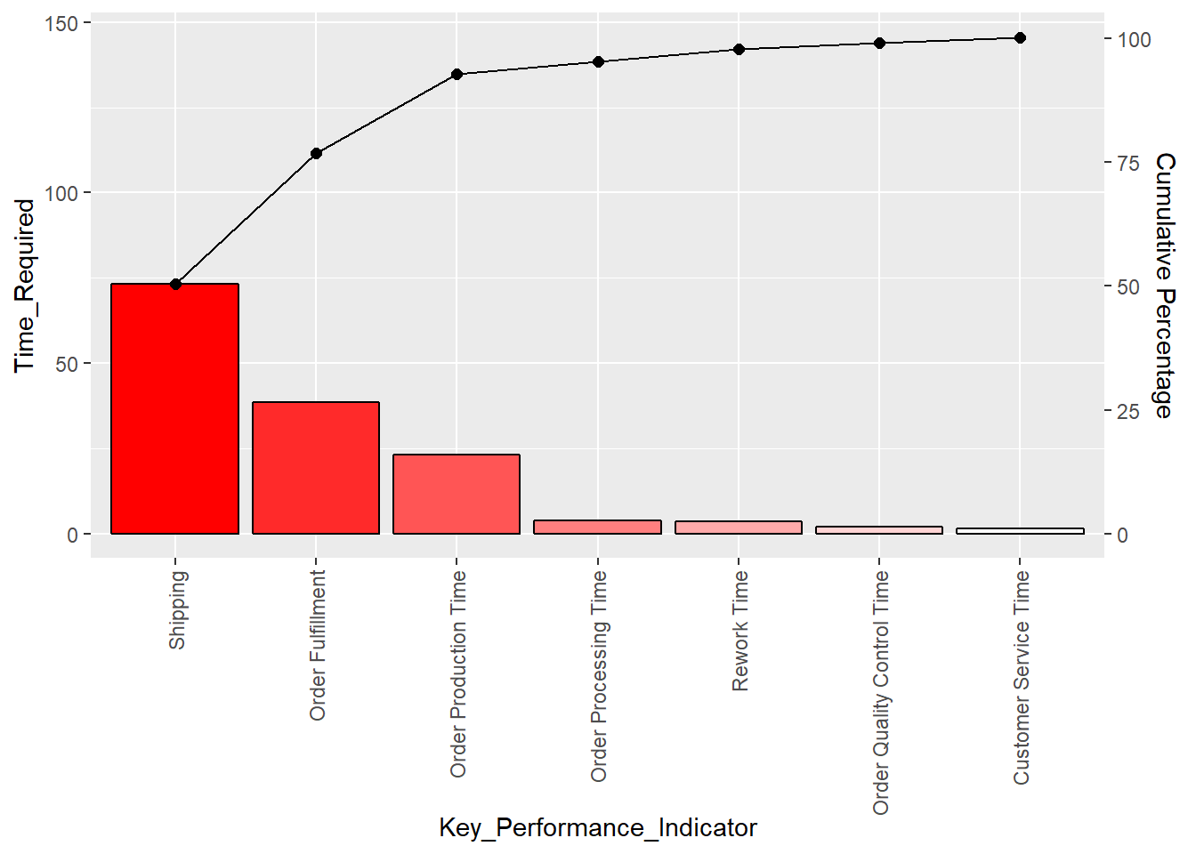
Awesome, the Pareto chart clearly shows where ACME Washer Co, needs to focus its effort if it plans on being in busniess in the forseeable future. You take the plot to your boss and explain that we can fix ~80% of our slow production problems by addressing the shipping proceedure and order fulfillment activities.
The boss smiles, dons his hat and coat and says, nice job. I want to see your plan for fixing the issues Monday morning - ACT.